White House Utility District
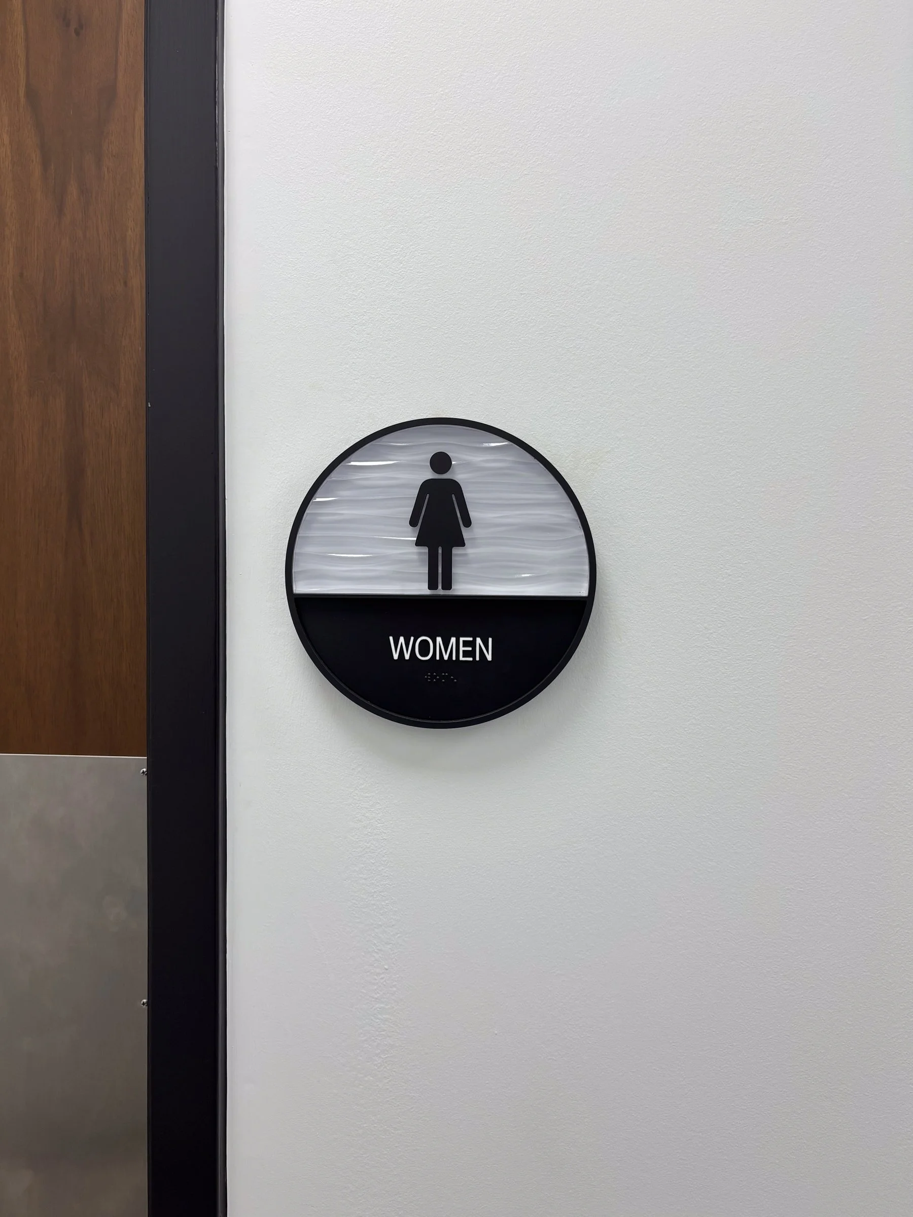
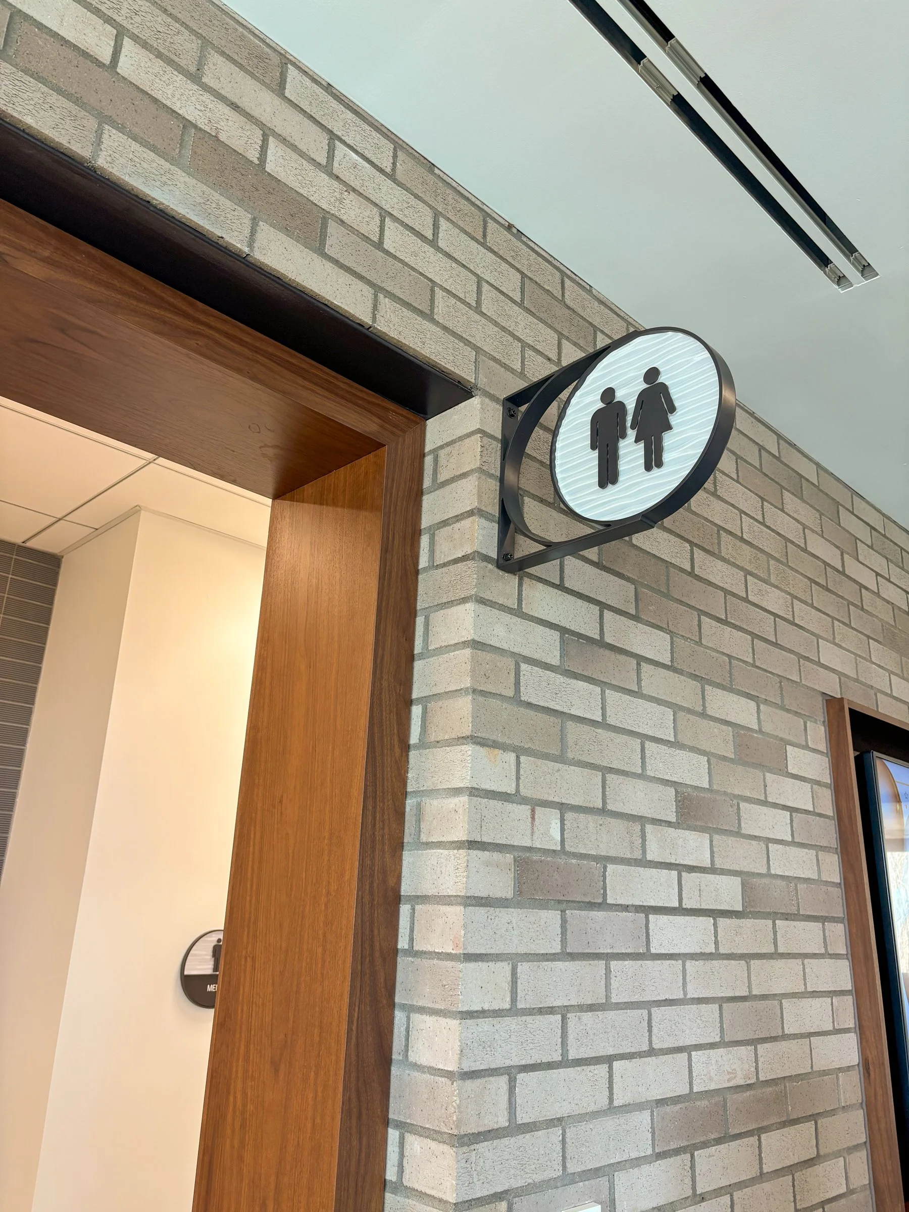
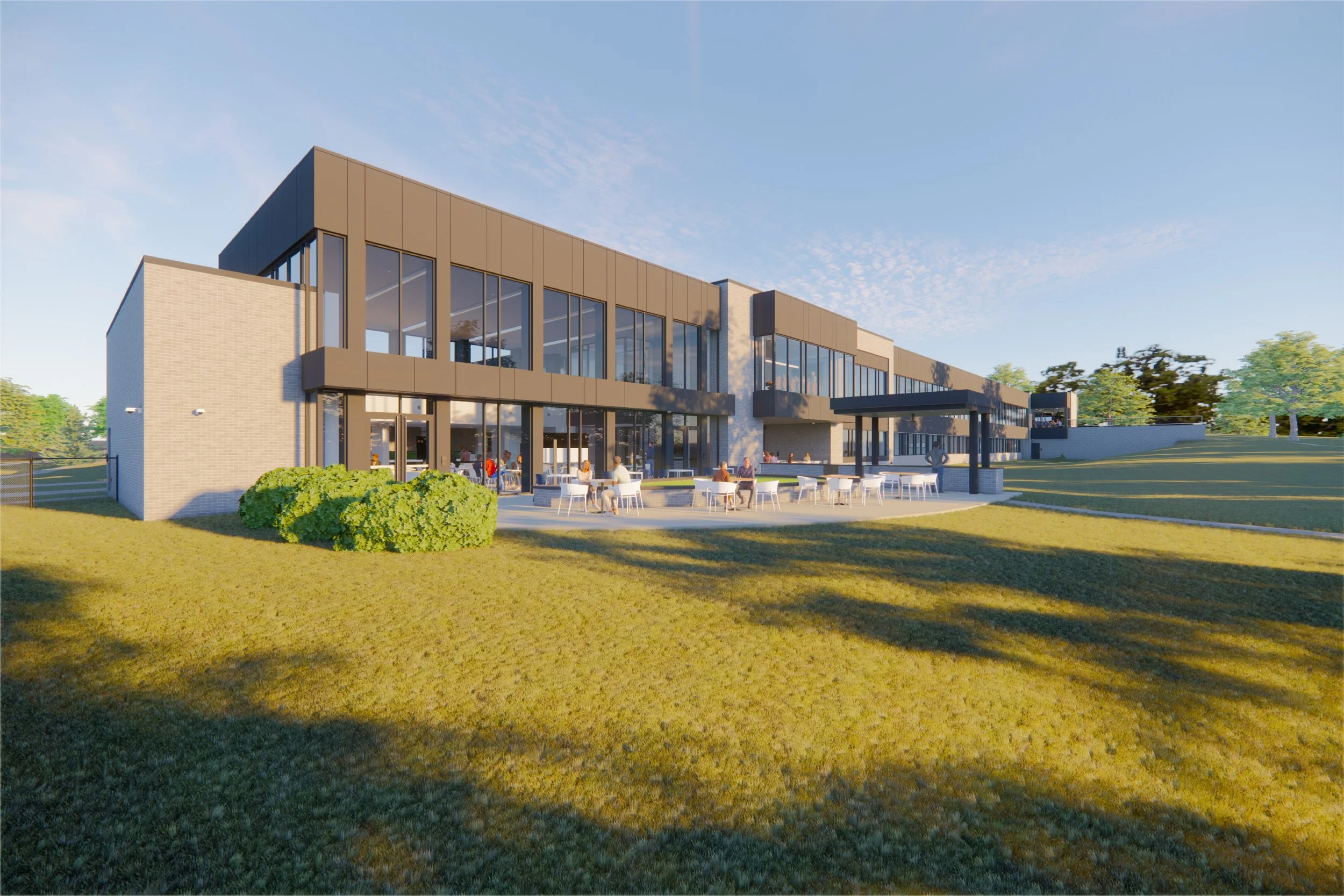
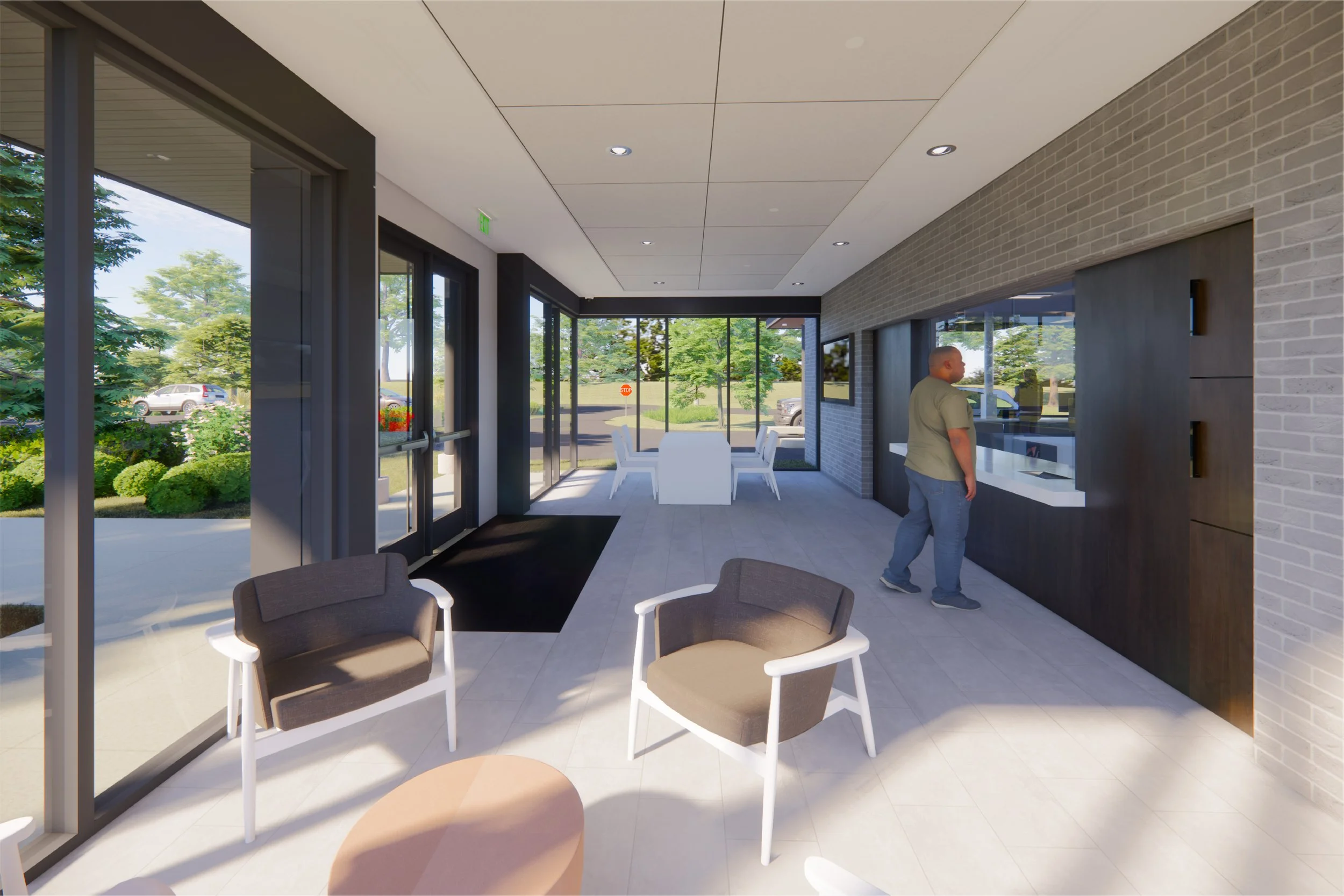
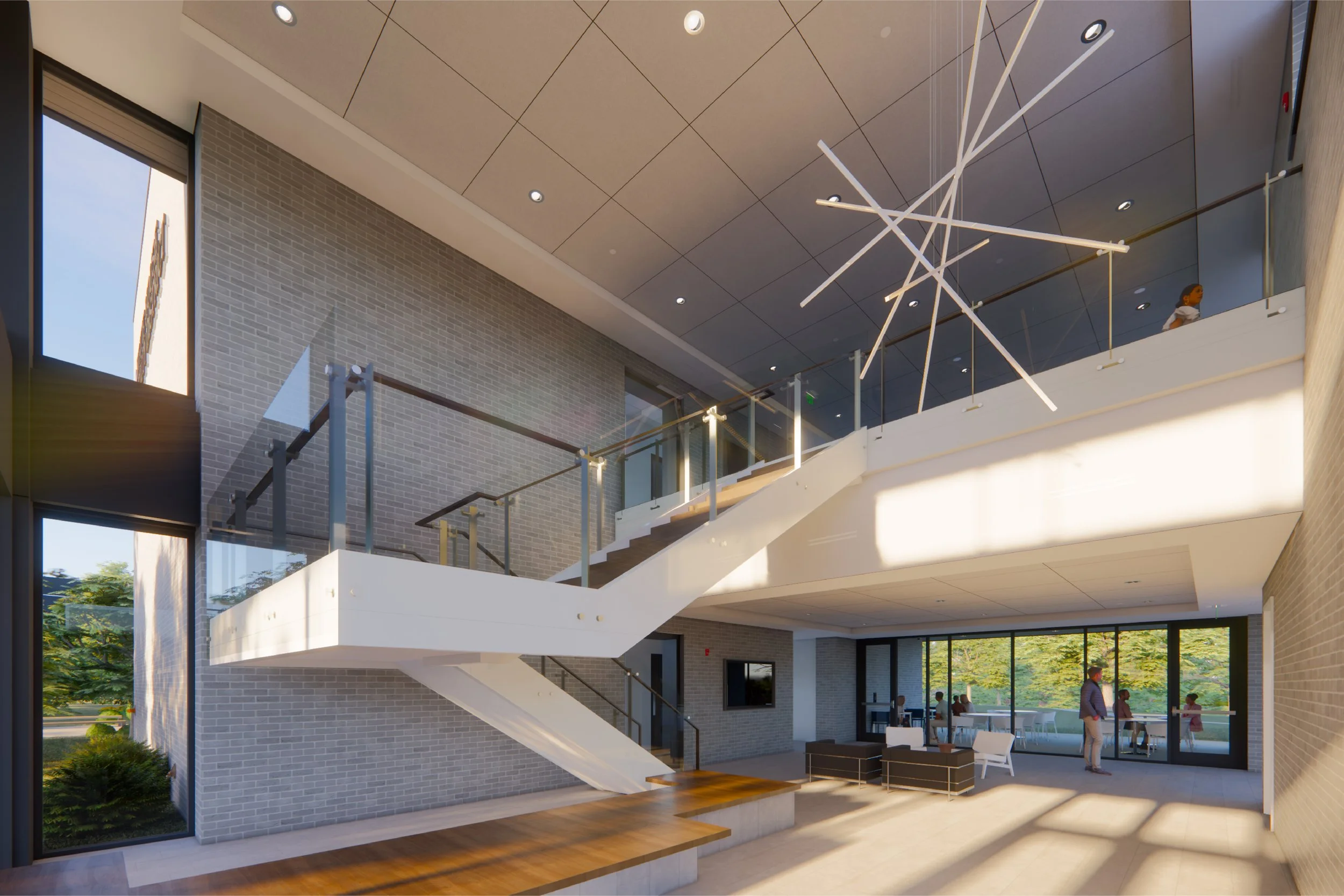
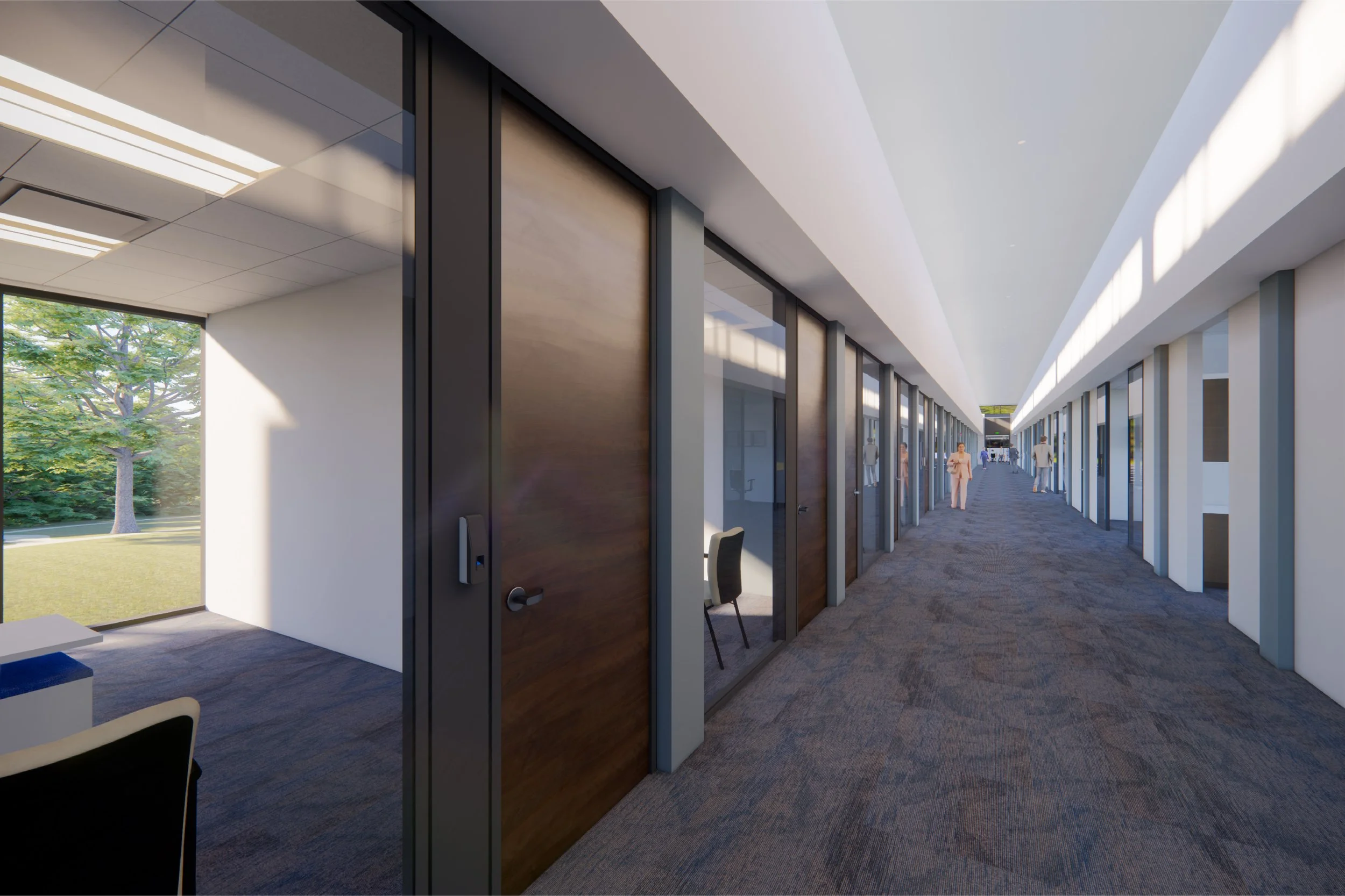
Water became the starting point for the signage and wayfinding system, informing a design language of wave-pattern acrylic, circular forms, and clean layered details. Developed to complement the architecture and interior finishes of White House Utility District’s new building, the system brings subtle movement and depth to everyday navigation. The result is a cohesive wayfinding family that feels fluid, functional, and closely tied to WHUD’s identity.
LOCATION
White House, Tennessee
CLIENT
White House Utility District
FABRICATOR
ImageLife Signs
SERVICES
Signage Design, Comprehensive Wayfinding, Project Management, Fabricator Coordination
FIRM
McCoy Design
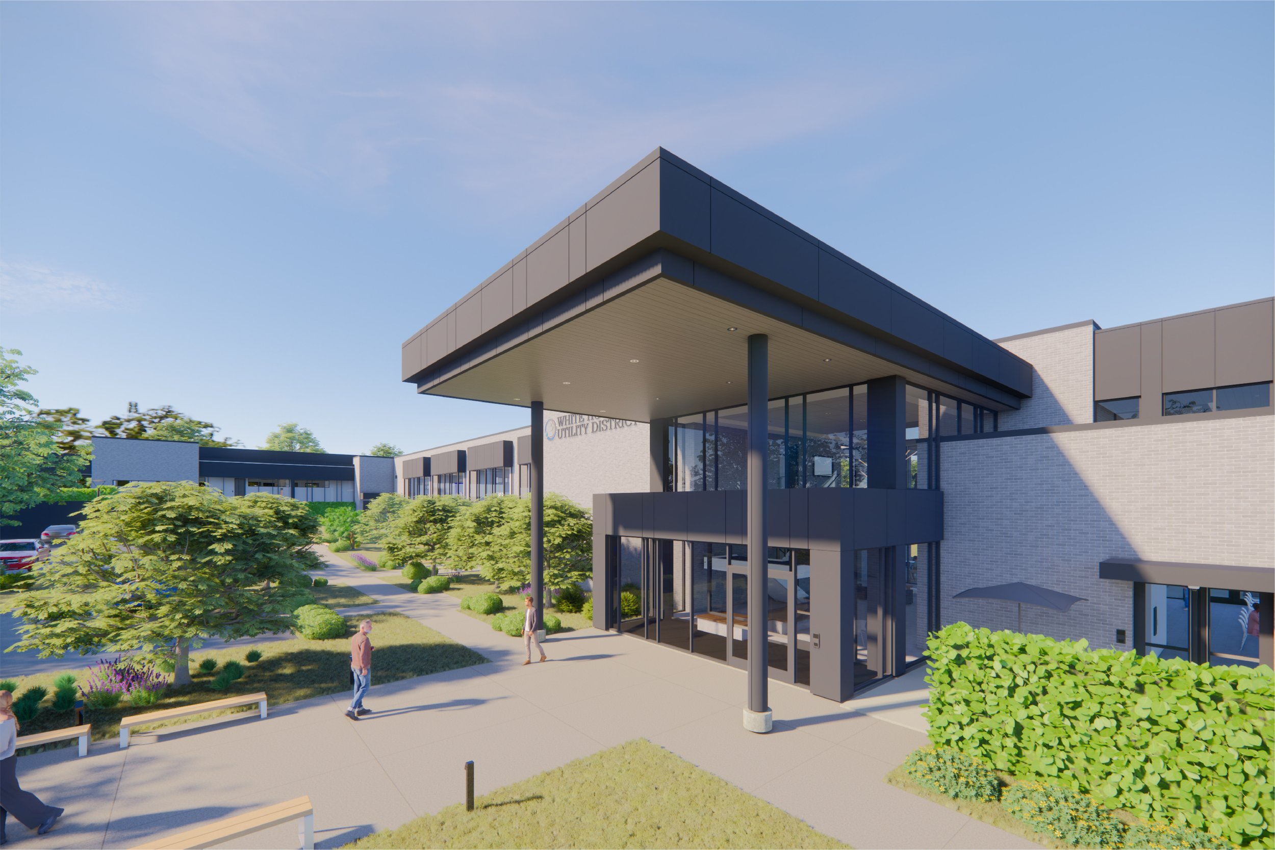

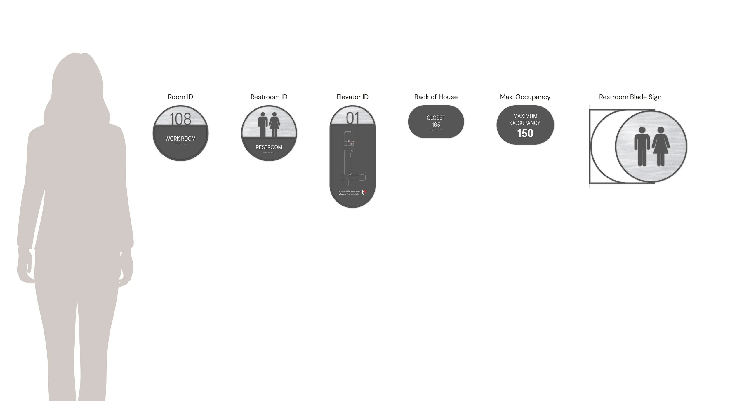
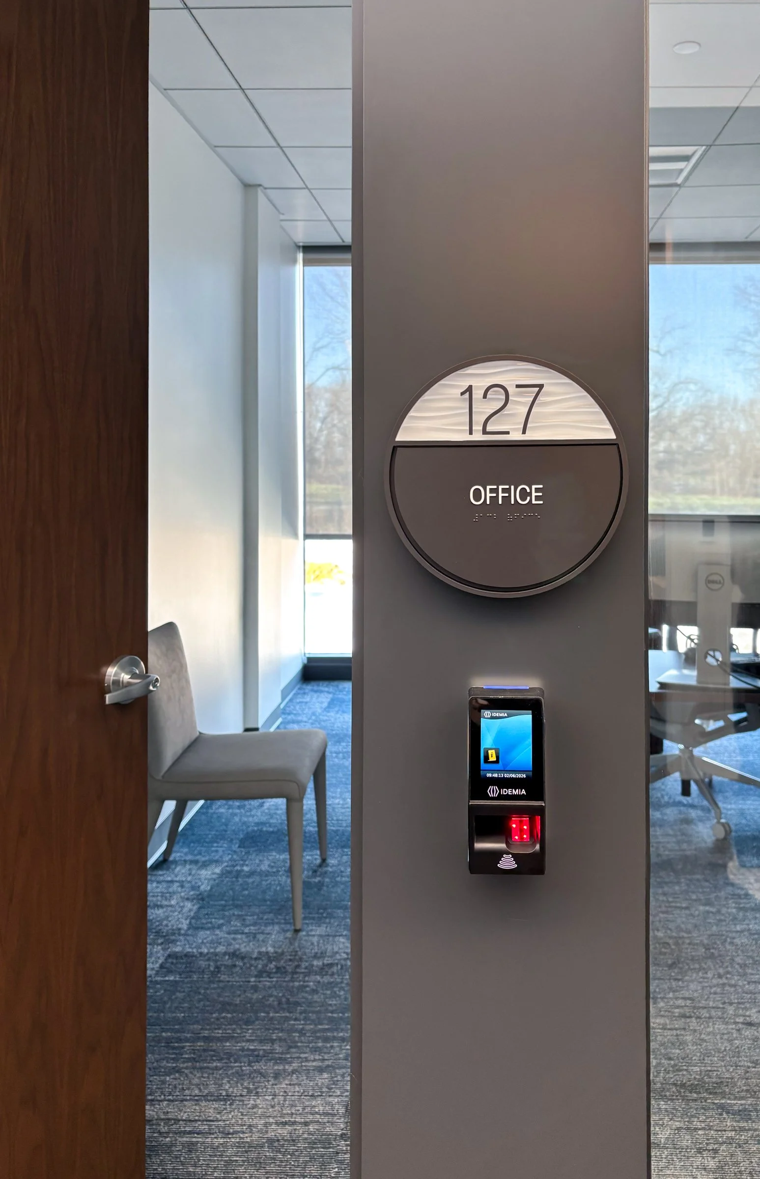
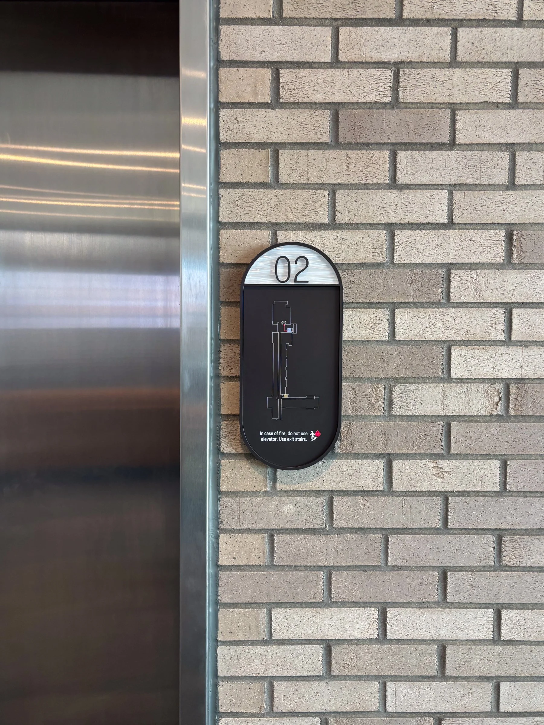
Partial interior signage family
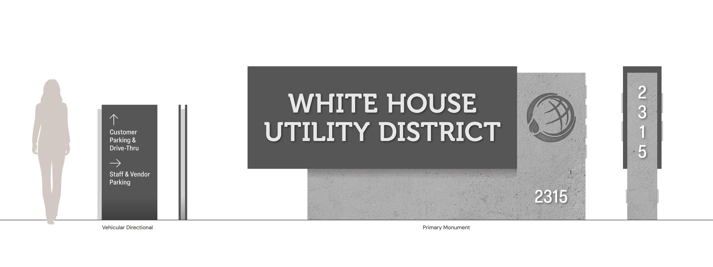
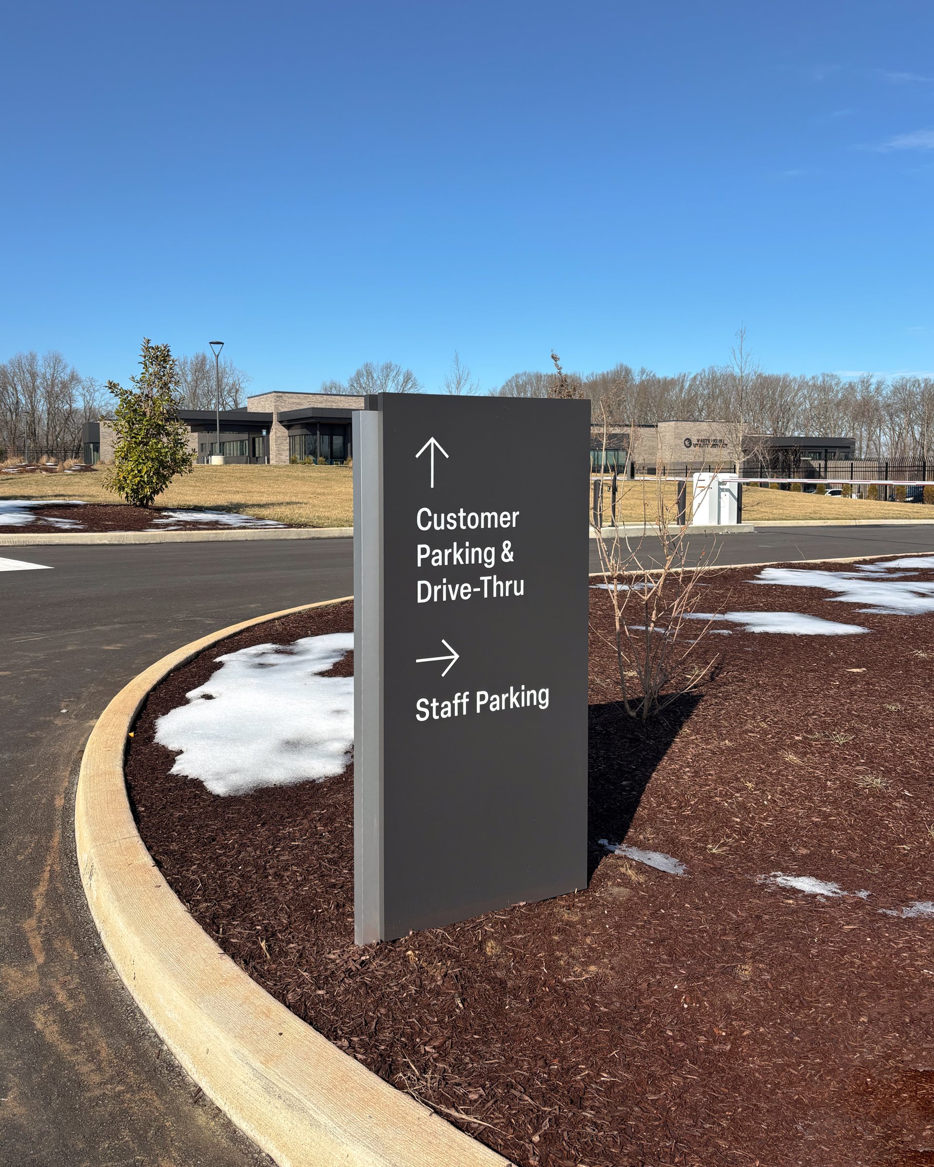
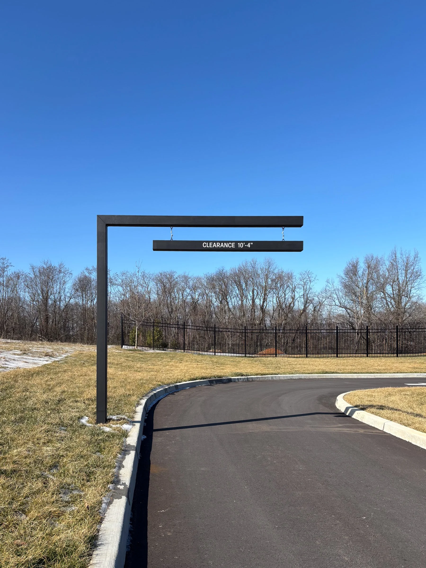
Partial exterior signage family
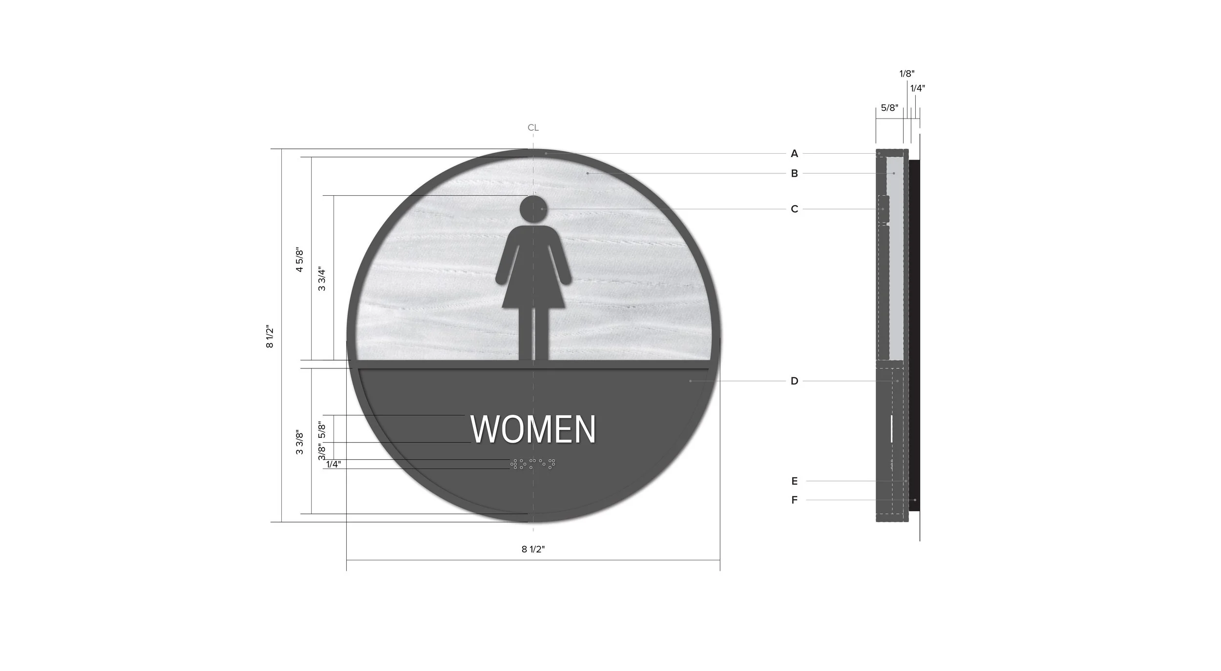
Restroom ID Detail
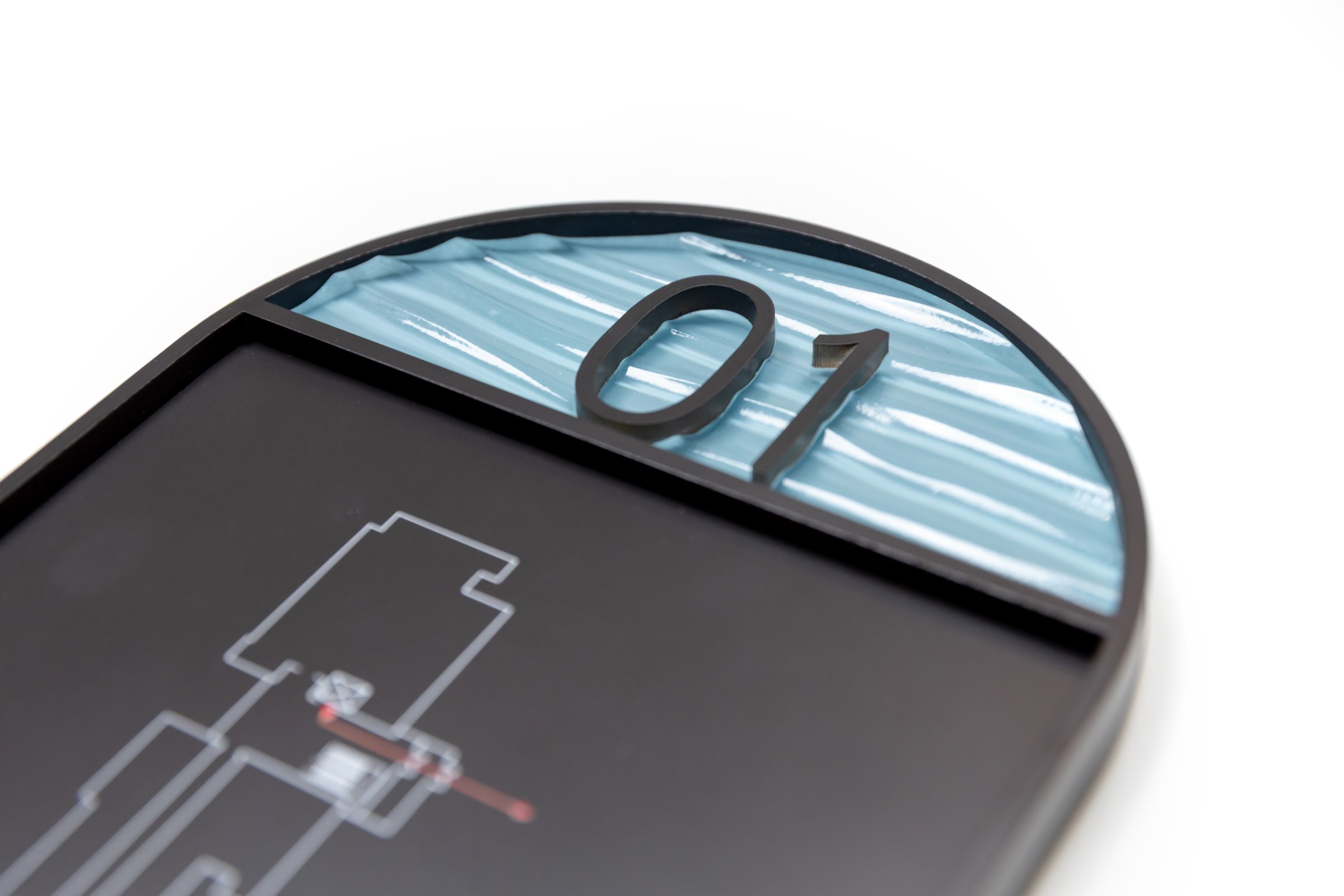
One of my favorite parts of this project’s process was seeing the wave acrylic come to life through material samples. Both the light blue and neutral white variations reflected the movement of water in different ways, with the final white direction offering a clean, subtle connection to the building’s interiors.

To make the signage more flexible for everyday use, the Room ID sign includes a removable magnetic nameplate that can be easily updated as needs change.
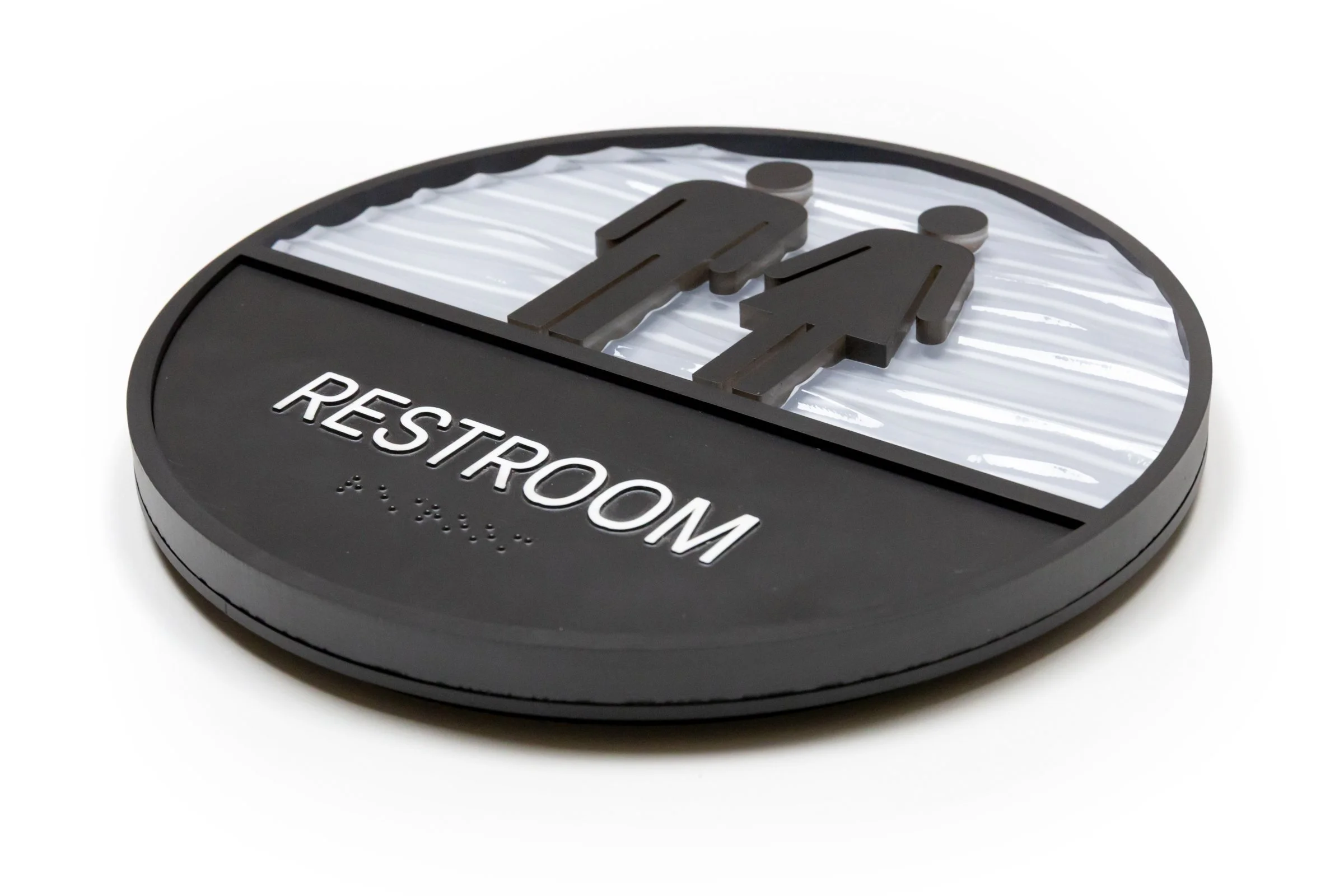
The sample review process helped refine fabrication details before final production. This included troubleshooting the seam between the icon forms and horizontal bar, as well as coordinating painted returns on routed dimensional accents for a cohesive finish across the sign family.

Photos from site visit


Photos from site visit